Plan finders
Principal UI Designer @ UHC in 2024
Context
One of the primary goals of uhc.com is to support consumers shopping for health insurance by connecting them to the right purchasing tools or contacts. Plan finders are central to that experience. Following a recent taxonomy update — and a broader effort to make uhc.com feel more like a store — I led a cross-functional initiative to streamline our plan finder strategy site-wide. Our goal was to increase transparency and coverage options, improve conversion rates, reduce user dead ends, while also laying the groundwork for future innovations.
A quick overview of the taxonomy update
The uhc.com ecosystem has historically been a bit fragmented, many of our product lines actually lived on separate sites. A major initiative in 2023 was to start unifying those experiences under the main uhc.com domain. We successfully migrated our standalone ACA site, and for others, we implemented a global navigation that could be proxied across those separate domains. This helped create the experience of a more cohesive, connected ecosystem for users, even if the underlying platforms remained distributed.
The landscape
We based our plan finder strategy on how much help someone needs as they move through the shopping experience. If they’re just getting started and unsure what kind of health insurance they need, they likely need more guidance. But if they already know the type of plan they’re looking for, we can offer a quicker, more direct path. Once we mapped this out and got it formalized, we started asking: how can we make our plan finders work even harder for our users?
Top of the funnel
Needs a lot of help
Plan selector component
This experience is designed for users who are just starting their shopping journey and aren’t yet sure what kind of insurance coverage they need. You’ll find this component in higher-level areas of the site — like the main navigation, the “Shop all plans” page, and paid media landing pages — where it helps guide users into the right flow.
Middle of the funnel
Needs some help

Product category ZIP plan finder
This experience is for users who know the general category of coverage they need — like Individual & Family plans — but aren’t sure yet which specific plan types are available to them. It shows up on category landing pages like Individual & Family, Supplemental Insurance, Medicare, Medicaid, and others, helping users explore options within their chosen path.
Bottom of the funnel
Needs less help
Product specific ZIP plan finder
This version is for users who already know what insurance product they’re looking for and are further along in the shopping journey. They’re more qualified and ready to move down the funnel. You’ll find this on specific product pages — like Affordable Care Act plans and UHONE plans — as well as on relevant content hub articles where users are showing strong intent.
Affordable care act plan finder
The problem
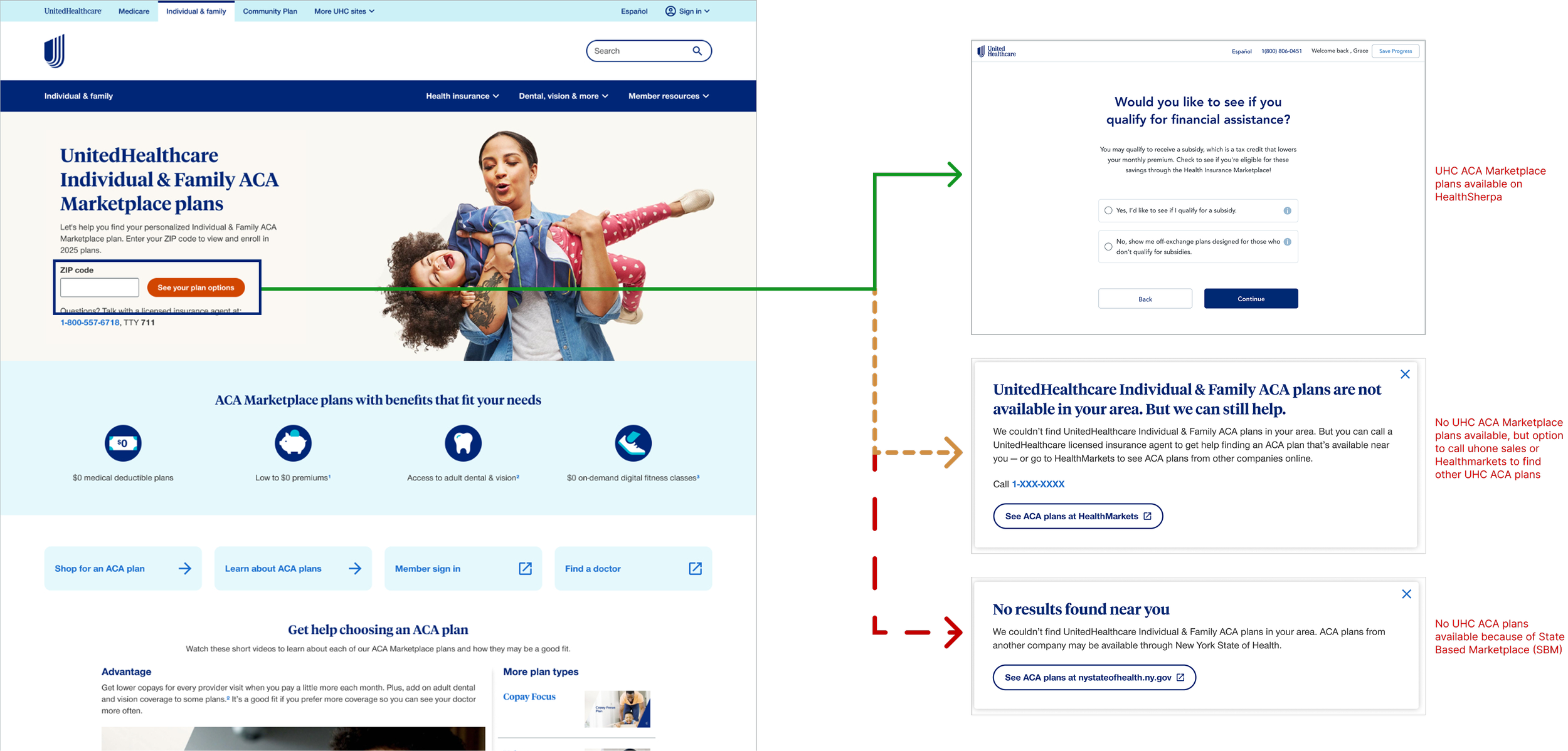
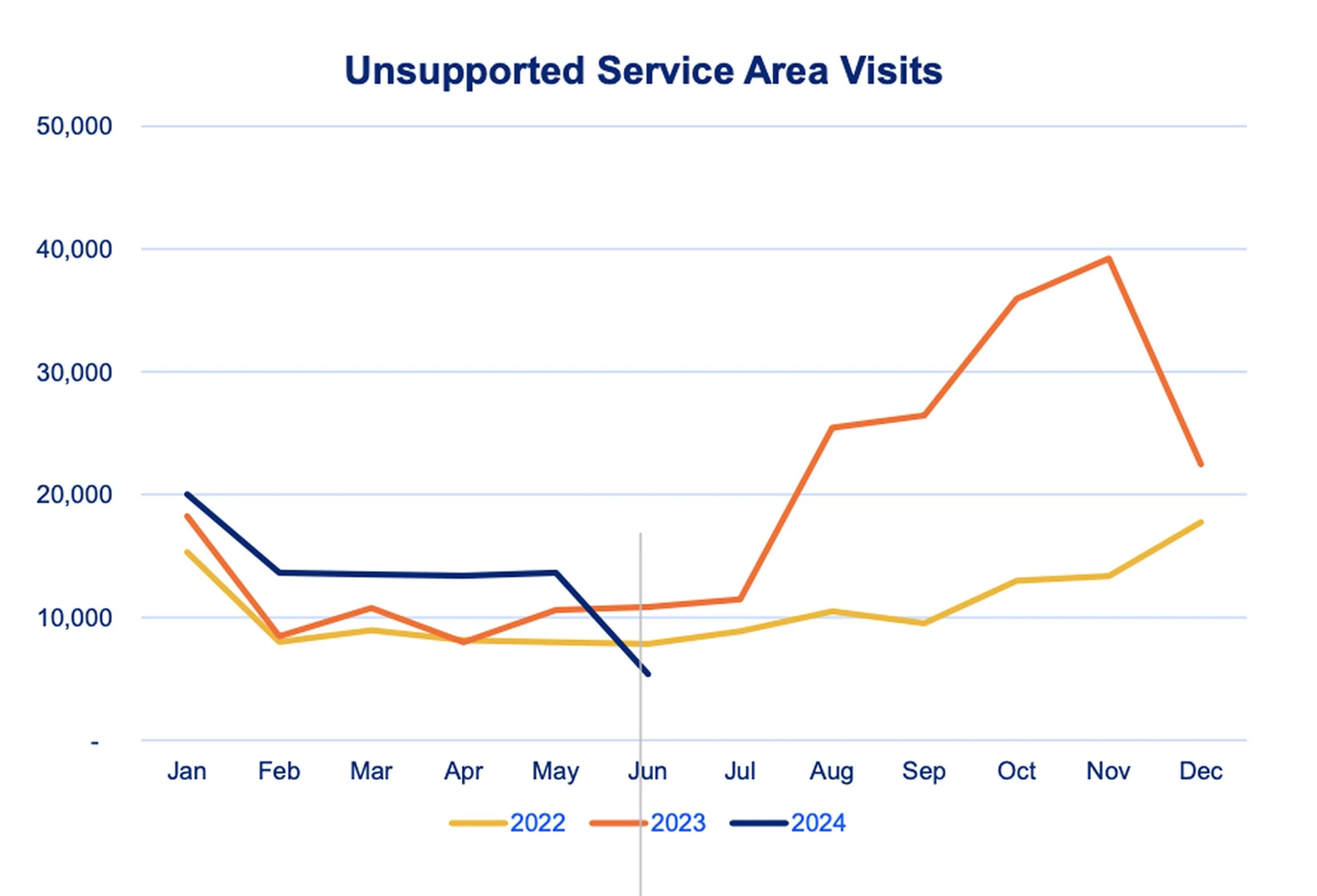
When consumers enter their ZIP code into our ACA Marketplace plan specific ZIP plan finders they are taken to the quoting tool on HealthSherpa regardless of whether plans are offered in their area. Resulting in dead ends down funnel without an easy way to get back to uhc.com to explore other ways we can support their needs.
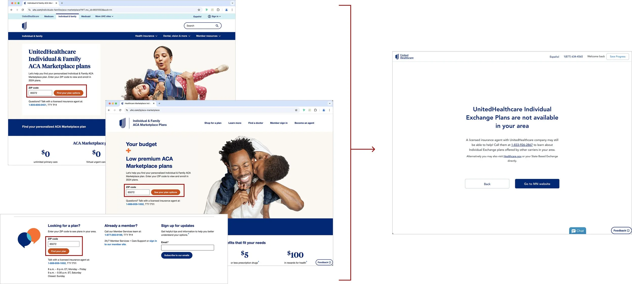
UHC Exchange plans are only available in about 50% of the United States. After our recent site migration and taxonomy update, we noticed an increase in visitors from unsupported areas landing on our ACA pages — often without realizing the plans weren’t available in their state.

How might we better support consumer’s shopping for ACA plans in unsupported service areas?
Limitations
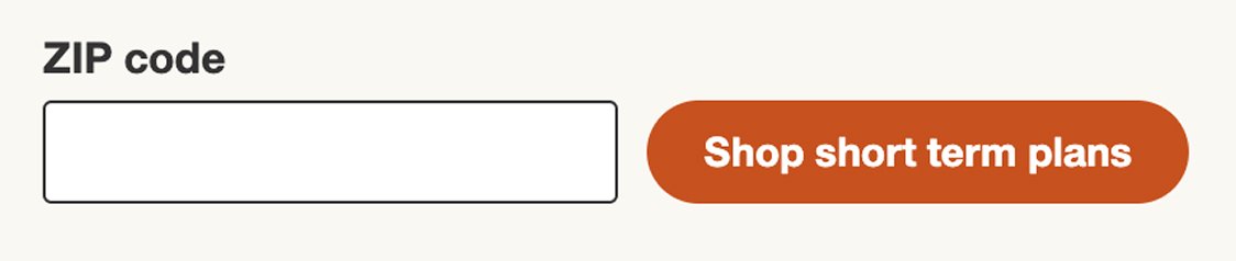
Why not offer or suggest another UHC product like short term?
We cannot suggest short term plans because they are not considered minimum essential coverage. We also want to make sure if the consumer is specifically looking for ACA plans that we support them in finding what they’re actually looking for.Why not display ACA Marketplace plans directly on uhc.com?
Government regulations are very strict with how we can show plans and HealthSherpa is a government approved and affordable quoting and enrollment platform.
The solution
For the final solution, I recommended showing a modal to users who enter a ZIP code outside of our ACA coverage area. The modal offers alternative coverage options — keeping the user on our site while gently redirecting them to plans that may better fit their needs. This approach struck the right balance: it acknowledged their intent, offered helpful next steps, and kept them engaged with the broad UHC ecosystem. Other concepts I explored either felt too heavy and confusing, or too subtle to catch the user’s attention. You can see those explorations here.
Results
67%
Decline in unsupported area visits to HealthSherpa
13,436
Referral clicks to shop.healthmarkets.com (uhc affiliate)
50k
Estimated consumers who were prevented from reaching a dead end in HealthSherpa
378
Sales calls to uhone call center (uhc affiliate)
Next steps
This solution is now part of our ongoing optimization efforts, where we continuously test and refine how to better support our users and drive conversions. From there, we took the learnings and results from this work and asked: how might we apply them one level up — to the broader Individual & Family plan category?
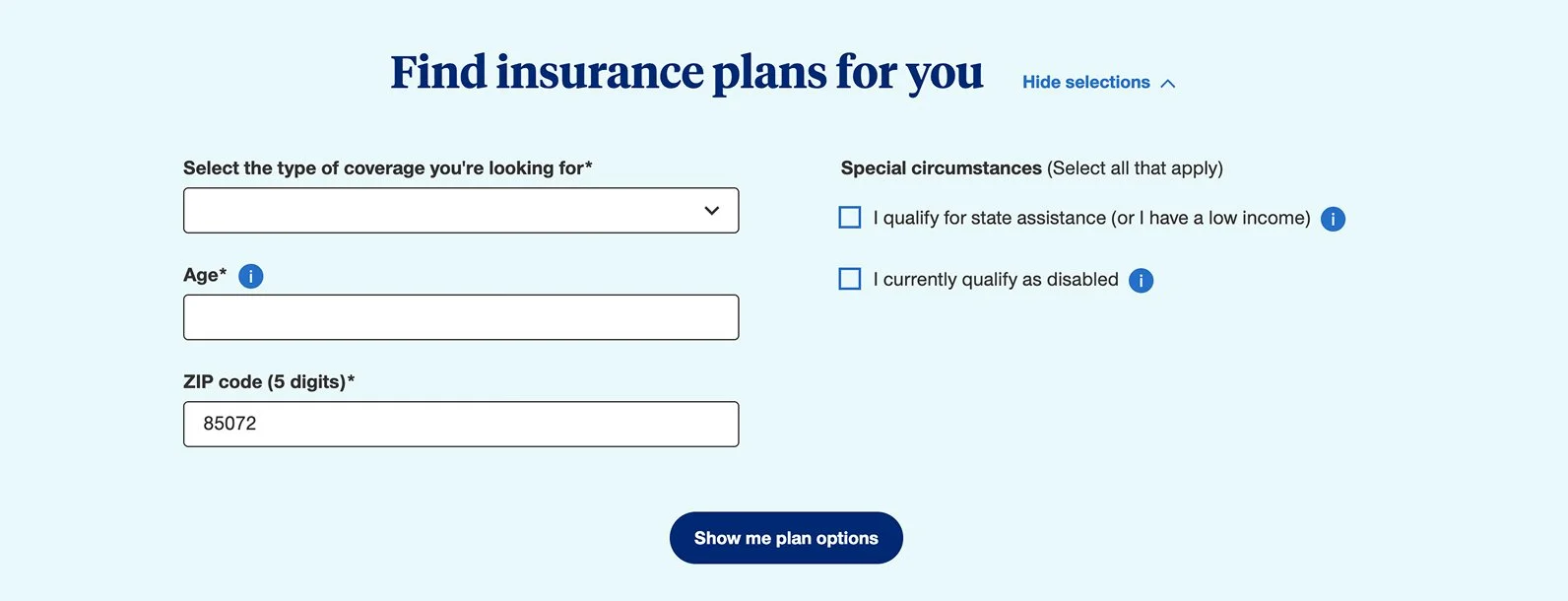
Individual & family plan finder
The problem
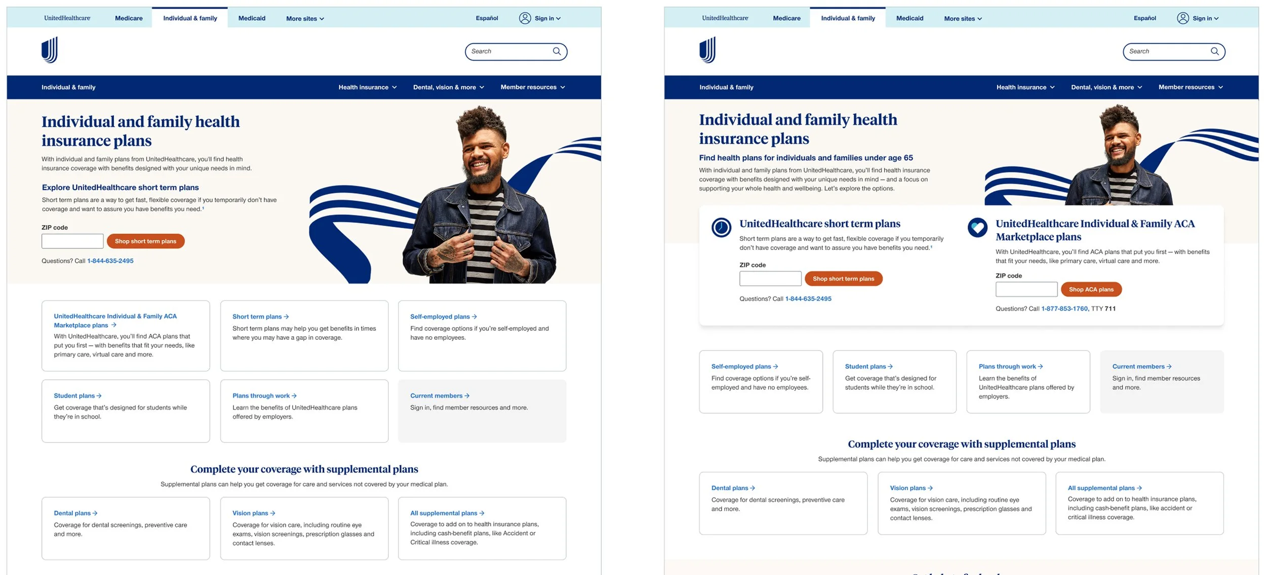
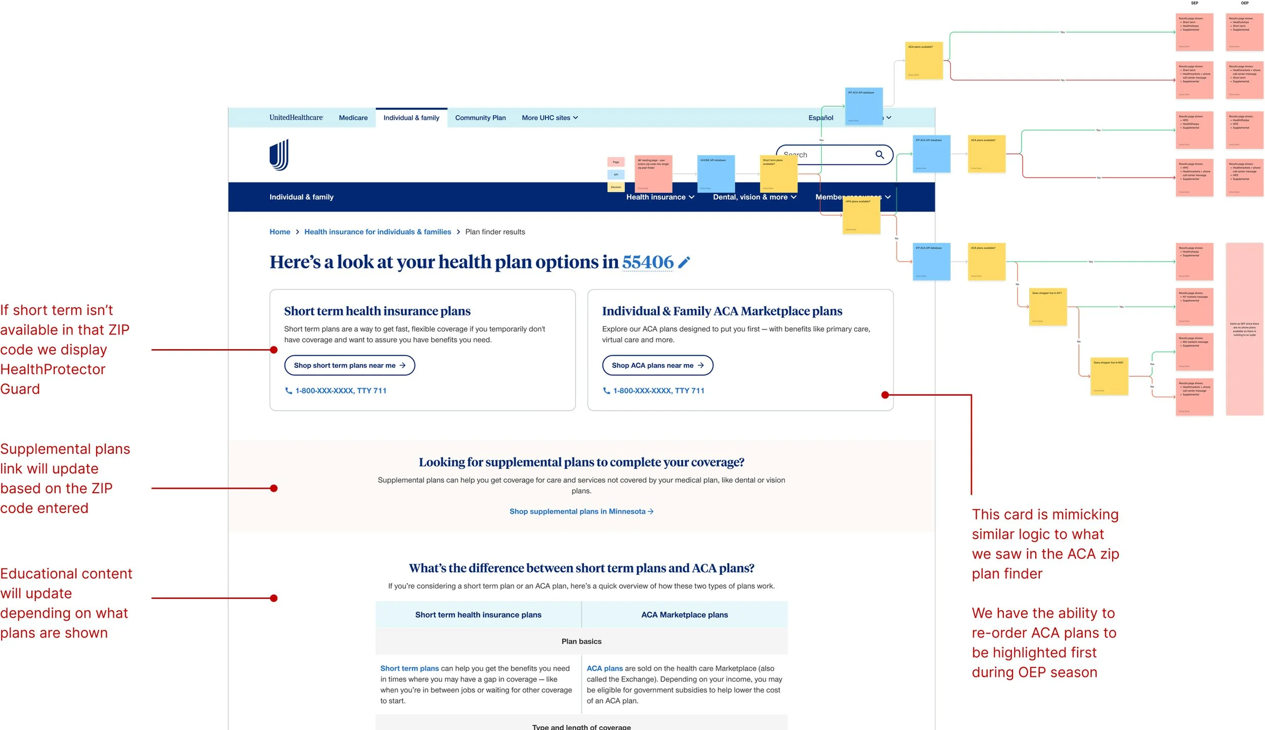
Our UHONE and ACA products rely on different third-party enrollment platforms. Because of this, our Individual & Family Plans landing page had to include two separate ZIP-based plan finders — one for each product line. This setup was confusing for users, who were forced to choose between two unfamiliar paths, often without clear guidance. It also placed the burden on them to figure out what coverage was even available in their area — sometimes leading them into funnels where we didn’t offer any plans at all.
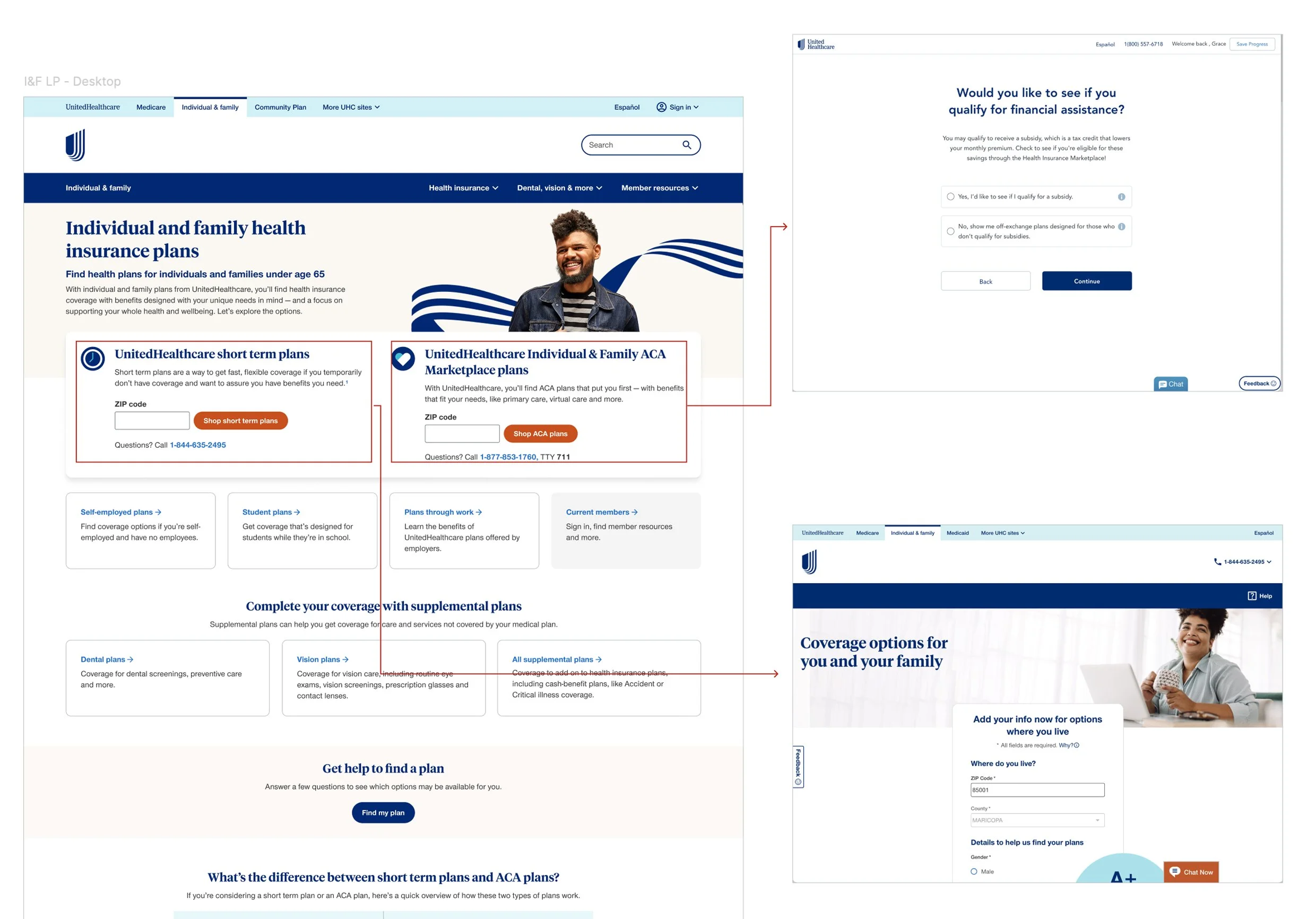
To improve the experience for users outside ACA Marketplace areas, we offered a geo-targeted ZIP code finder for ACA Marketplace plans only. But it felt like a band-aid, hiding what wasn’t available instead of clearly explaining it. The approach lacked transparency and missed an opportunity to build trust through education.
How might we create a consolidated experience to better support and educate consumers on plans available in their area?
Limitations
Why not offer or suggest another UHC product like short term?
We cannot suggest short term plans because they are not considered minimum essential coverage.Why not display ACA Marketplace plans directly on uhc.com?
Government regulations are very strict with how we can show plans and HealthSherpa is a government approved and affordable quoting and enrollment platform.Why can’t we surface all plans and enrollment on uhc.com?
Because of how our websites are set up, we’re limited in how we can display different insurance plans.
The Solution
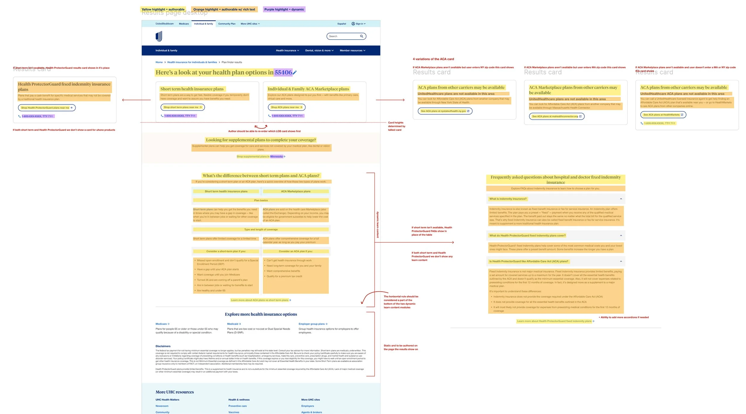
I designed a streamlined ZIP code finder that helps users quickly see which individual and family plans are available in their area. Unlike the ACA ZIP plan finder that showed results in a modal, this experience lives on a full page to accommodate multiple plans and offer clear explanations to support informed decisions and create more qualified enrollment leads. The results are dynamic and surface alternative plans to avoid dead ends and ensure transparency.
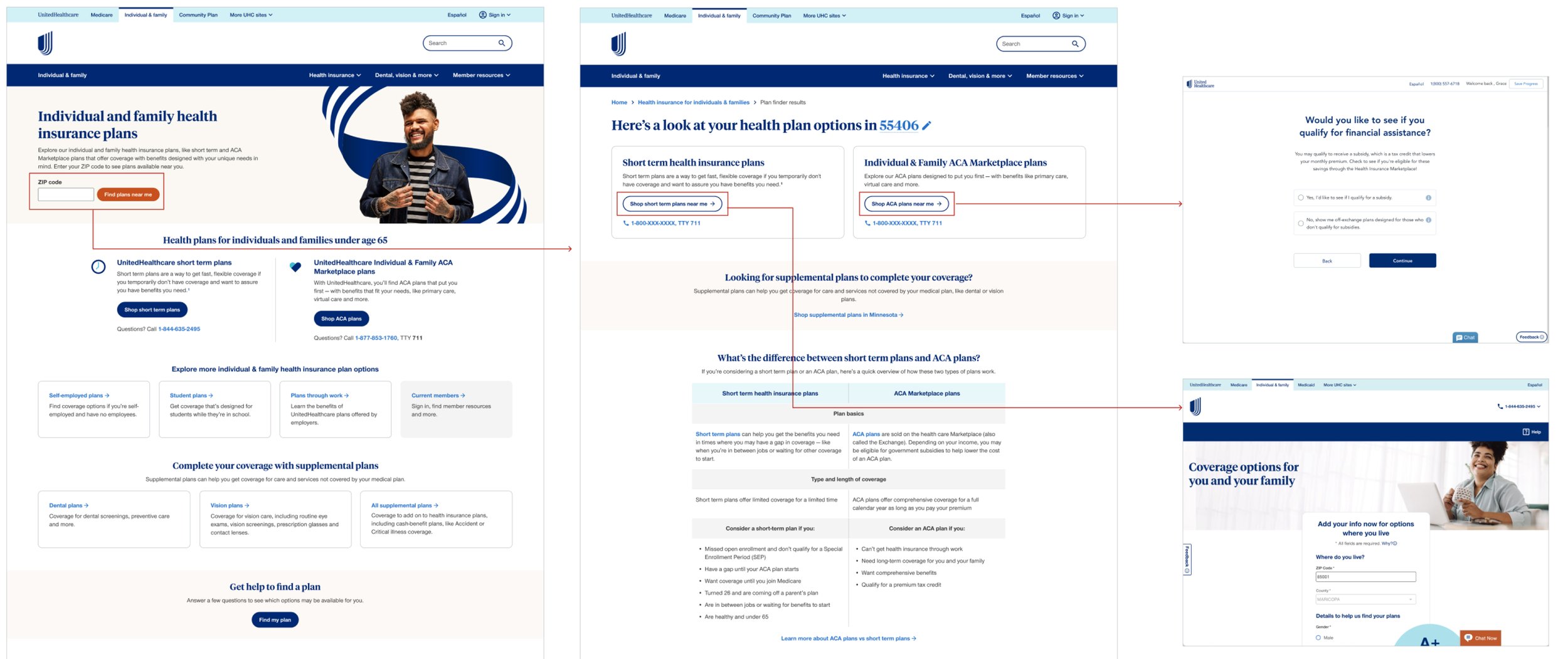
I worked closely with developers and content authors to deliver detailed Figma specs for this dynamic page — outlining logic, editable AEM regions, and all possible user journeys. This ensured a smooth build and empowered teams to manage and scale content confidently.
Next steps
We tested the redesigned single ZIP plan finder experience against the default geo-targeted version to understand its impact on user engagement and lead quality. While overall leads from the top of the funnel decreased, especially for our short term plans, the new design drove significantly more qualified traffic — resulting in a 168% lift in order conversion rate and a 22,357% increase in ACA plan engagement. Based on these results, we moved forward with the redesigned experience, which is now live and undergoing ongoing optimization as part of our “always-on” testing strategy.
Future state workshop
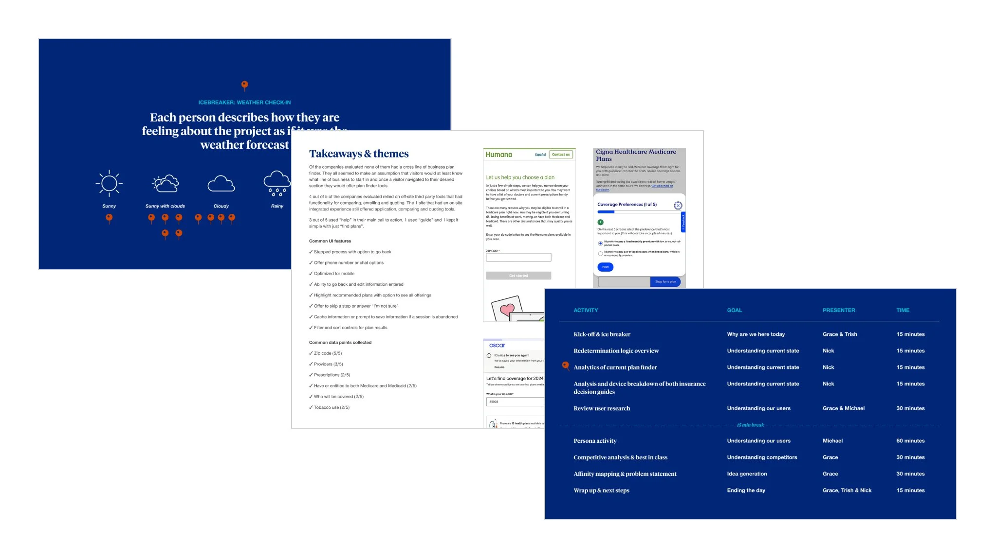
To align cross-functional teams and define a long-term vision for our Plan Finder experience, I led a collaborative design thinking workshop focused on uncovering unmet needs and prioritizing areas for future investment. We used person-based HMW exercises, affinity mapping, and thematic voting to explore pain points across different user mindsets - especially the disengaged and uncertain. The workshop helped surface common themes like transparency, education, confidence-building, and steamlining complexity. I synthesized the outputs into a clear problem framing to guide upcoming roadmap planning and future research.