Homepage refresh
Principal UI Designer @ UHC from 2022 - 2025
Context
From February to July 2023, uhc.com saw over 5.8 million visits — averaging nearly a million visits each month. The site serves 41 distinct audience segments, with 30 considered primary: from shoppers and members to employers, brokers, providers and more.
The biggest challenge? Every visitor expects the content to speak directly to them.
In 2023, we set out to refresh the homepage by asking: “How might we speak to many audience at once — while helping each one quickly find what they need?”
Our goals also included:
Making a strong first impression
Telling a clear, timely brand story
Communicating expectations up front
Improving mobile optimizaion and component flexibility
Operationalizing content updates
And ultimately, increasing leads
In this case study I’ll walk through how I led the effort to reimagine the homepage experience from the ground up.
Workshop
The first step in reimagining the homepage was getting clear on the problem we were solving, and why it mattered. To align on goals and uncover user needs, I organized a cross-functional 1-day hybrid design thinking workshop that brought stakeholders together around a shared understanding.
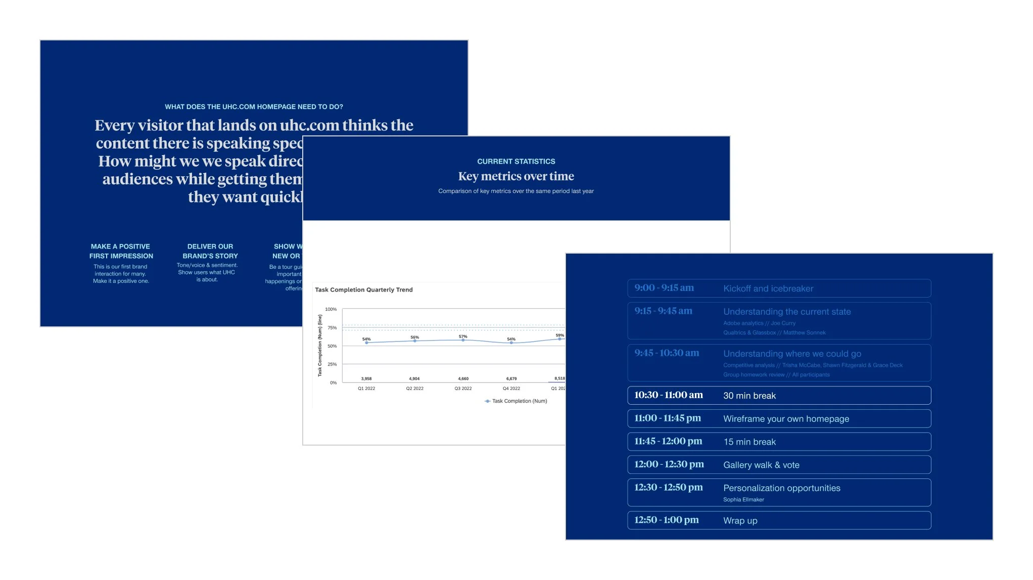
I planned and facilitated the workshop, shaping activities to uncover key user and business needs. To ground the conversation, I led a competitive analysis and brought in guest speakers to share insights on analytics, product goals, and areas for optimization and personalization.
Goal for the day
Idea generation to approach the default homepage design from a new angle
Immediate outcomes
New default homepage design to then use as template for personalized experiences
Agenda
Understanding the current state
Adobe analytics overview - Marketing team
Qualtrics & Glassbox walk through - Optimization team
Understanding where we could go
Competitive analysis and best in class overview - UX team
Group homework review - each participant brought an example of a digital experience they found successful, along with a few key takeaways on what made it effective
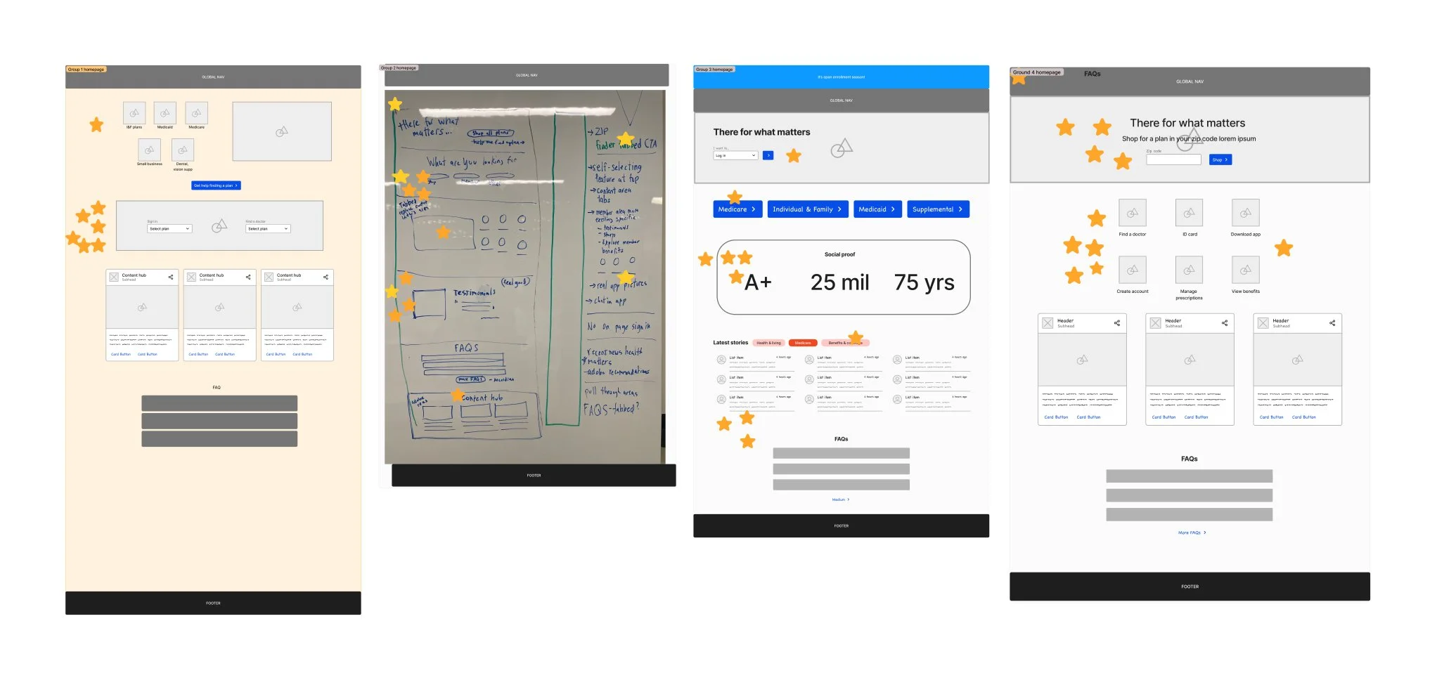
Wireframe your own homepage group activity
Gallery walk of homepages and dot voting on favorite features
Personalization opportunities - Optimization team
The session created strong alignment across teams and left participants feeling grounded in a shared understanding of the challenge and clear on where to go next.
Through discussion and dot-voting, two key themes emerged:
A desire to add a quick self-select call to action — either task or audience oriented to help users navigate confidently from the start
The importance of conveying trust and credibility through a brand-forward element such as a value proposition, testimonial or social proof
These insights directly shaped the next phase of design exploration.
User Testing
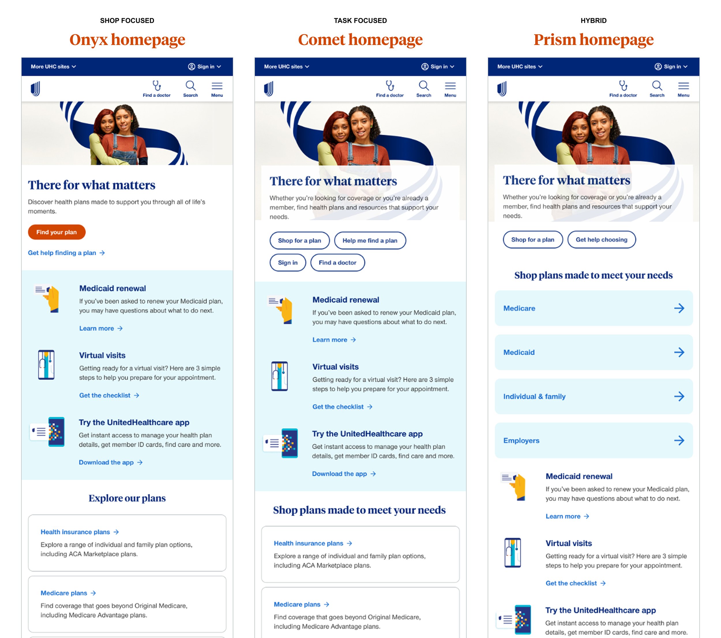
After the workshop, I transitioned into rapid prototype — creating three concept directions designed to test a different approach to solving the core homepage challenges.
Onyx prototype = main calls to action are very shop focused
Comet prototype = main calls to action are top tasks across shoppers and members
Prism prototype = a hybrid of shop calls to action with additional links to self select into an audience type
To reduce bias, the prototypes were intentionally named using neutral labels rather than an alphanumeric system. The top section of each design carried the primary variation, allowing us to isolate and evaluate how that specific change impacted user behavior — without introducing too many variables or adding unnecessary scope.
In hindsight, introducing a bit more design variation may have provided deeper insights, but this approach helped keep the test focused and manageable.
After several rounds of internal feedback and iteration, I designed and ran a user test to evaluate how each approach performed and resonated most with users.
Scope & focus of test
Test 3 concepts against each other for the homepage (mobile mockups) measuring a combination of qualitative (survey questions) and quantitative (user tasks) measurements to understand which homepage layout is going to be the most successful and user friendly.
Method
Unmoderated within-subjects usability preference test
20 participants (Medicare, Medicaid, ACA & U65 audience panels)
Each participant completes 3 tasks on each prototype and then at the end is given a preference survey
Success criteria
Understand which homepage layout users prefer
Understand which homepage layout provides a better user experience
Key insights
| Prototype | Preference | Satisfaction |
|---|---|---|
| Onyx - shop focused | 20% or 5 participants | 100% were satisfied or very satisfied |
| Comet - task forward | 35% or 7 participants | 71% were satisfied or very satisfied |
| Prism - hybrid approach | 45% or 9 participants | 100% were satisfied or very satisfied |
“Find my plan button was a different/bold orange color which made me gravitate towards that button to help me. In other prototypes the shop for my plan blending in with other buttons and colors too much”
- Medicaid participant
Participants mentioned wanting to explicitly see the words “learn”, “about us”, “why choose UHC” or “value for choosing” – this validates a lot of the value prop work that’s been going on
Several participants made comments about liking the big orange button and how it made shopping simple
Participants liked the quick link cards but also liked the further plan descriptions below
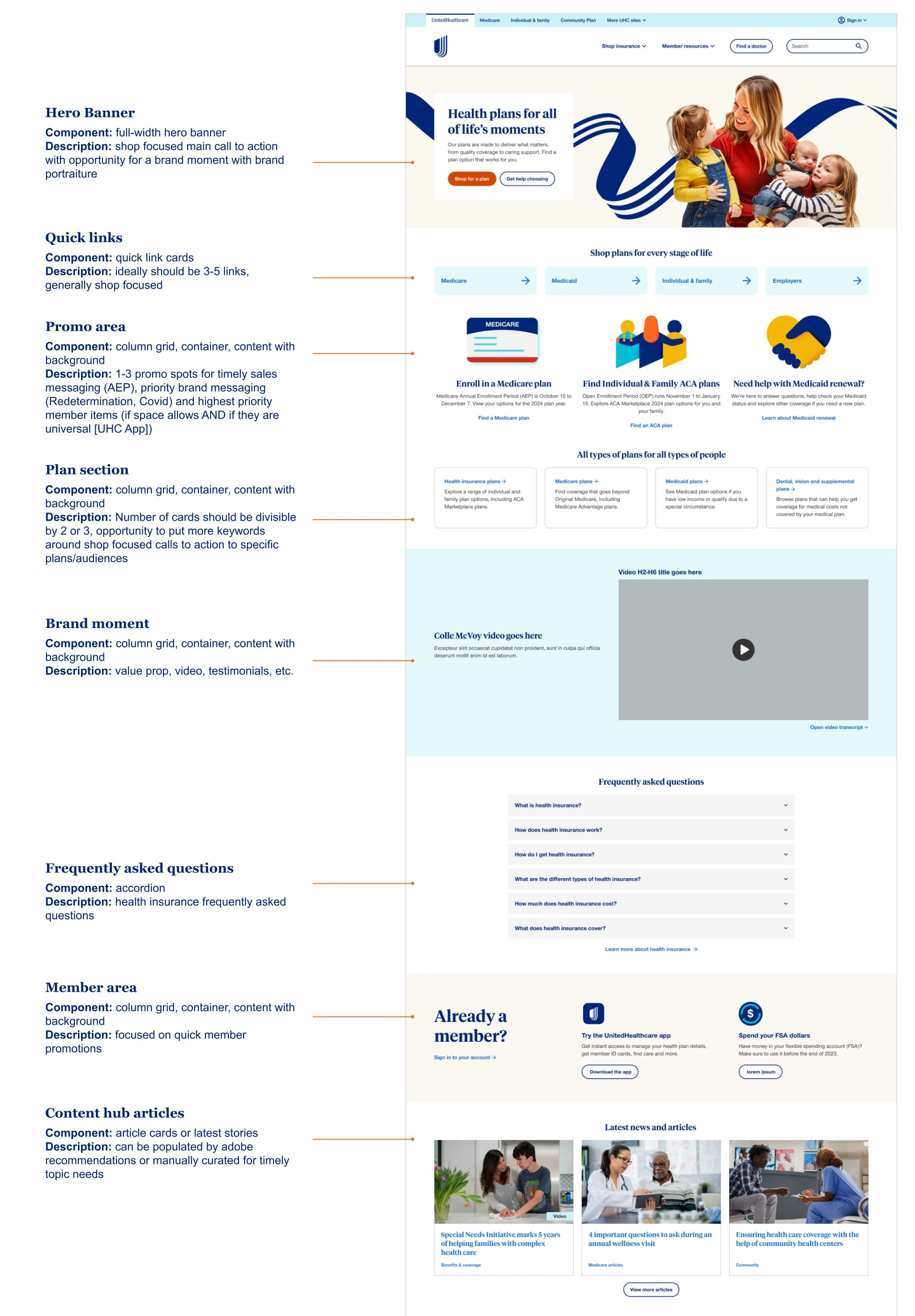
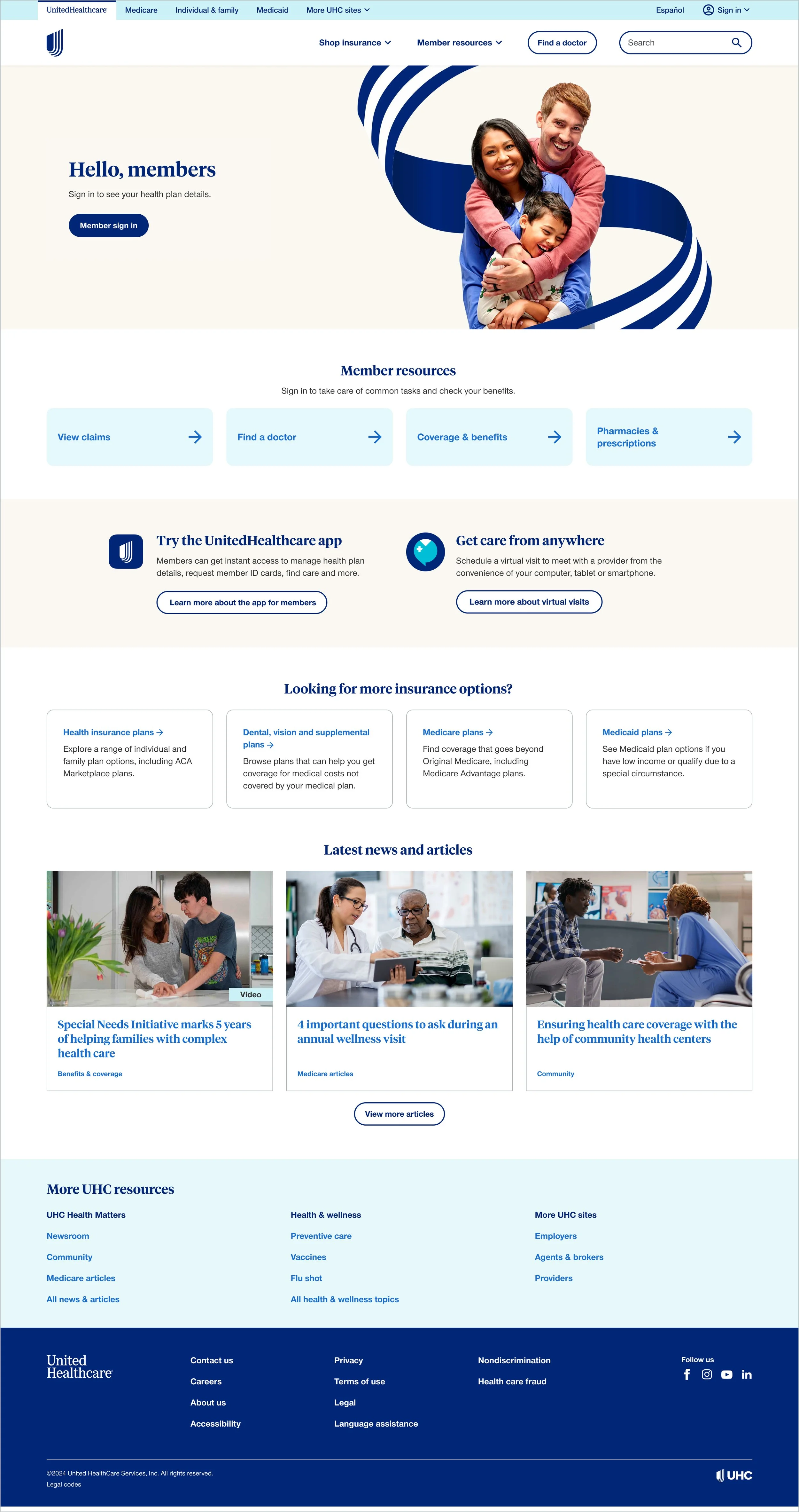
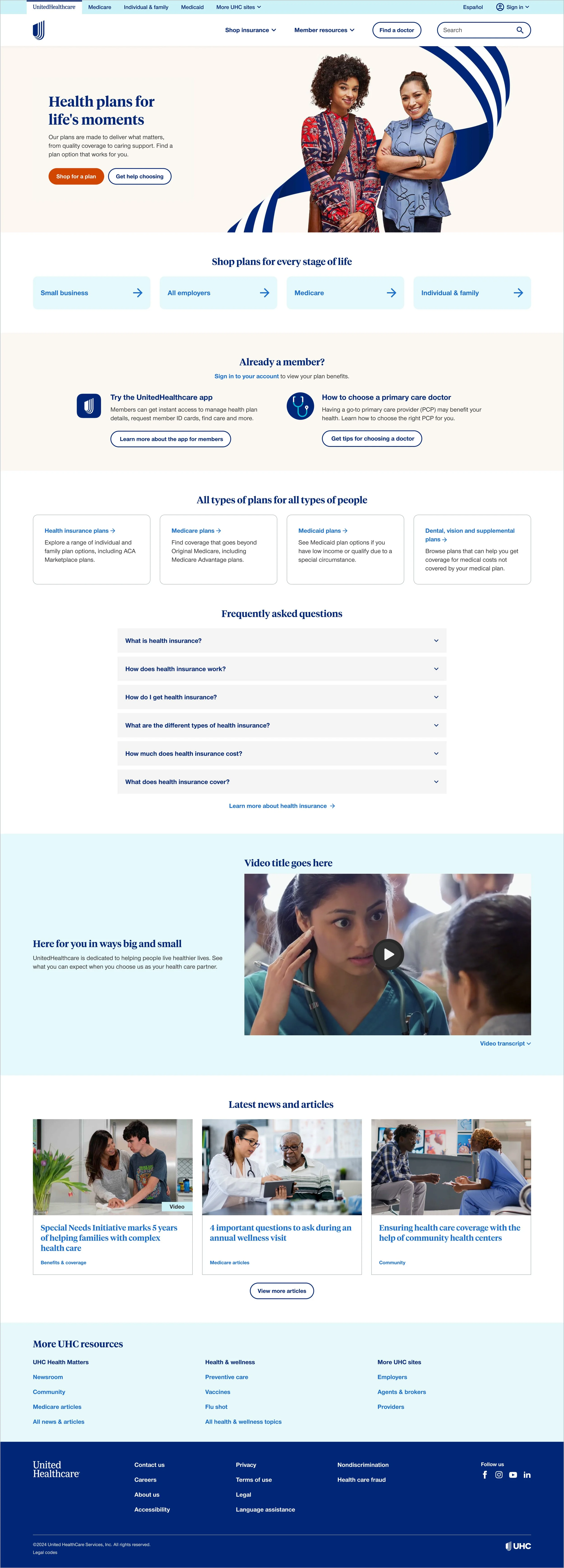
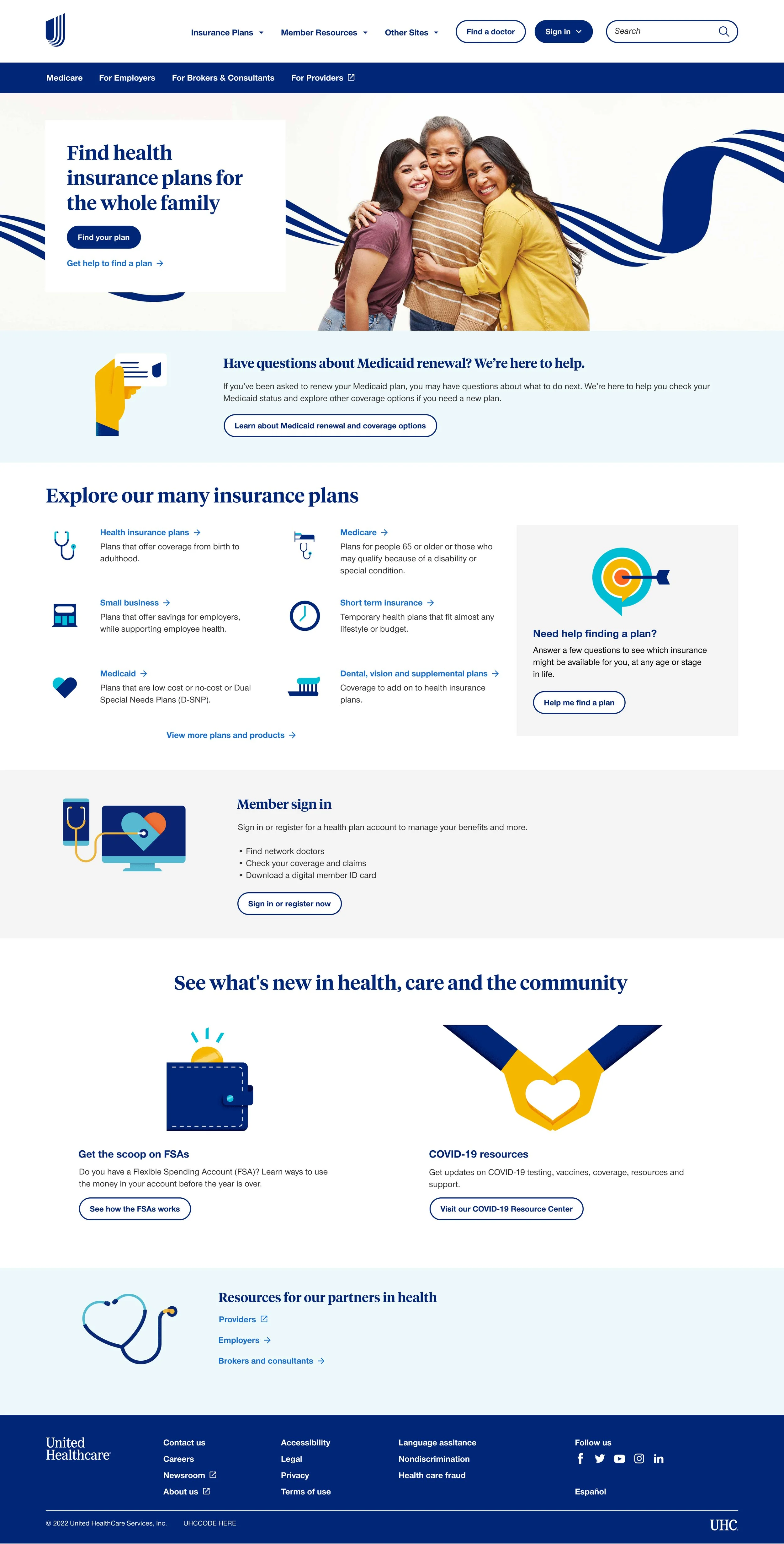
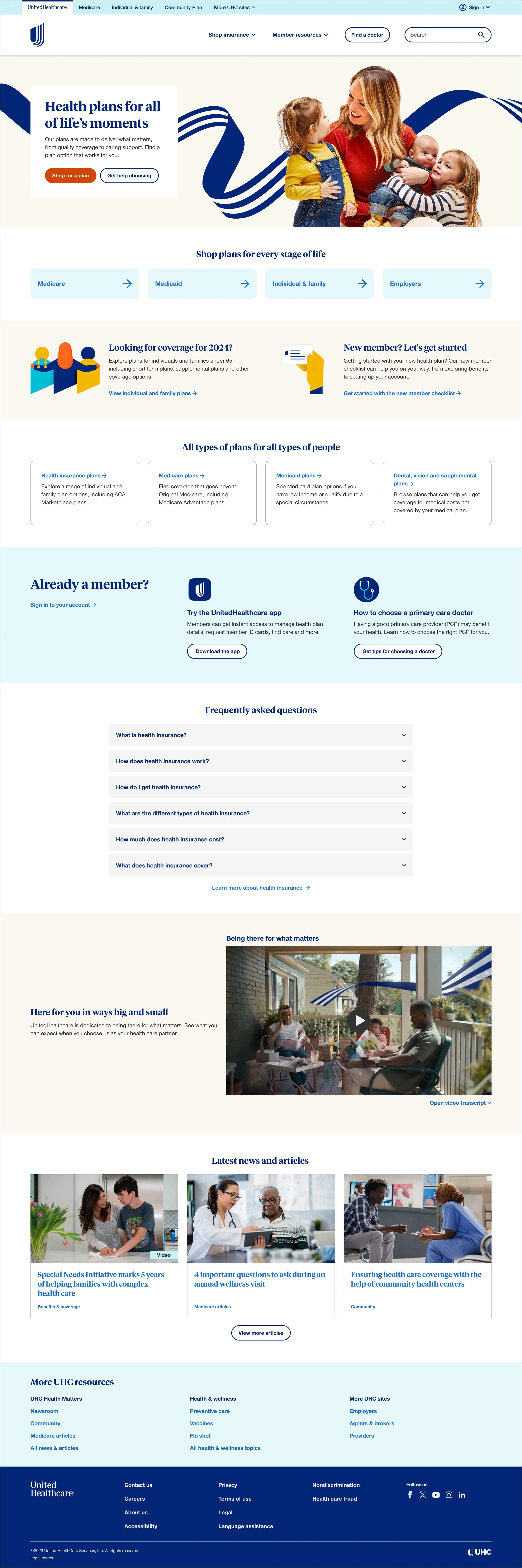
Default template
With insights from both the stakeholder workshop and user testing in hand, I moved into another round of design iteration and feedback to shape a homepage template that met the needs of both users and business. Key findings from testing helped validate and refine our direction: participants expressed a clear desire to see terms like “learn,” “about us,” or “why choose UHC” — reinforcing the importance of including a strong value proposition. The prominent orange button was frequently mentioned as making shopping feel simple and approachable, confirming its role as an effective visual anchor. Users also responded positively to the quick link cards for easy navigation, while still appreciating the added detail in the plan descriptions further down the page.
These insights came together in a default homepage design that balanced clarity, trust-building and action. Below is a breakdown of the final page anatomy and how each element supports user needs and business goals:
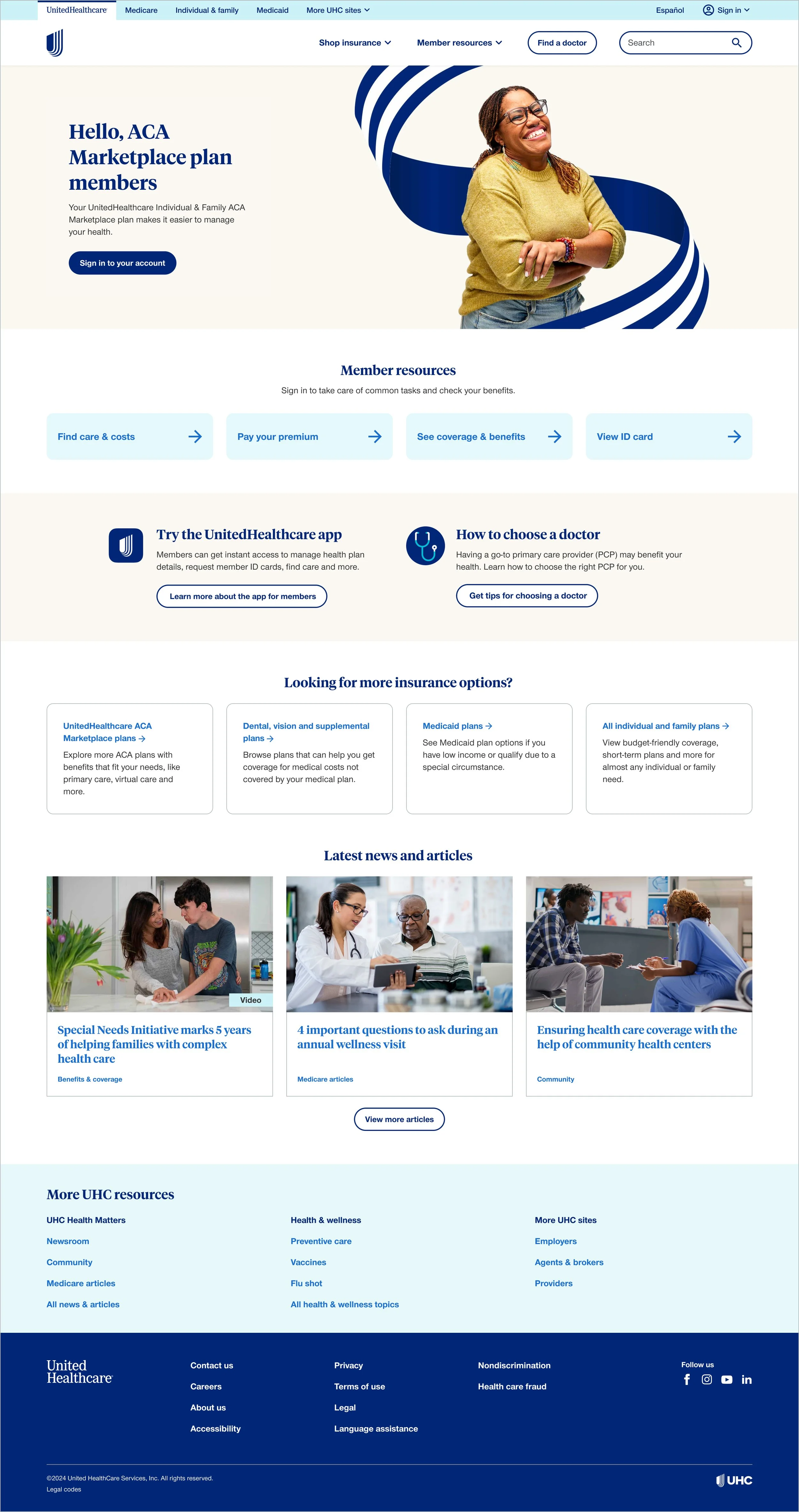
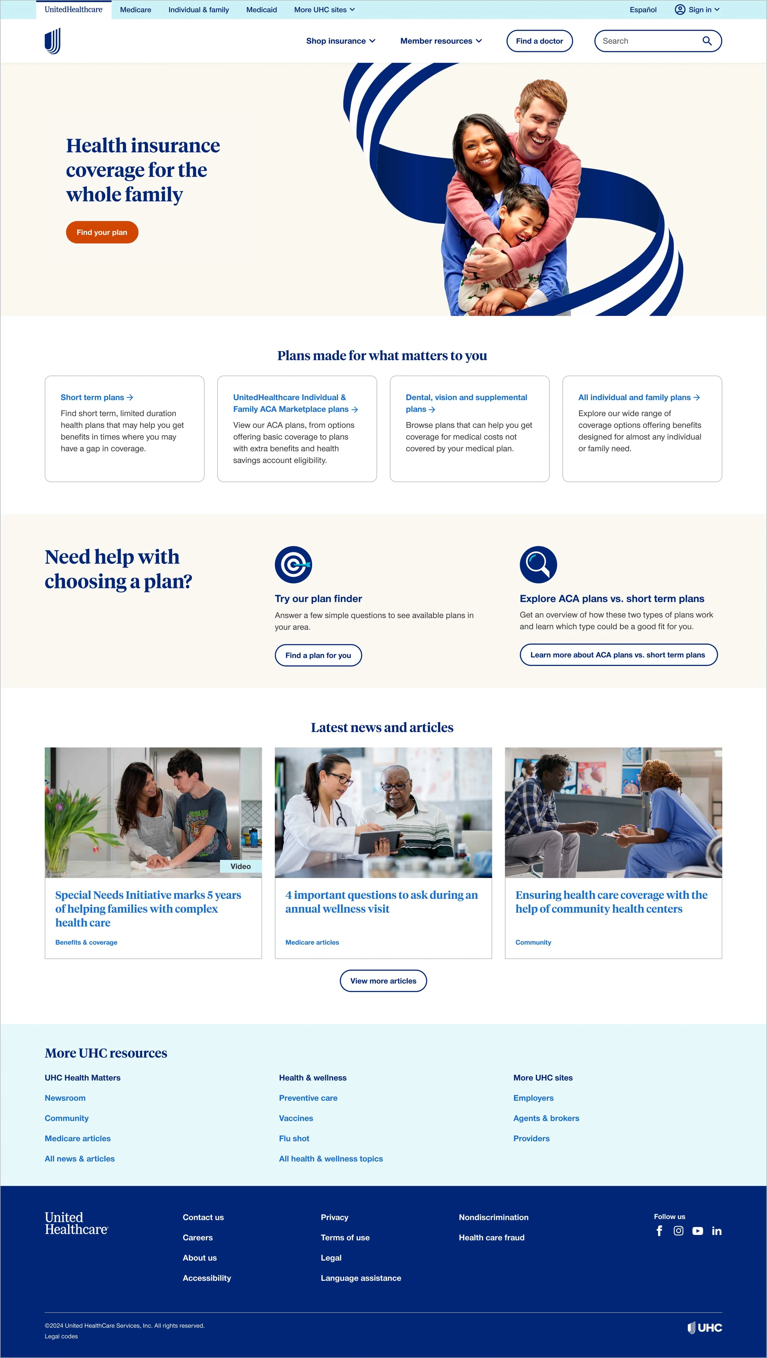
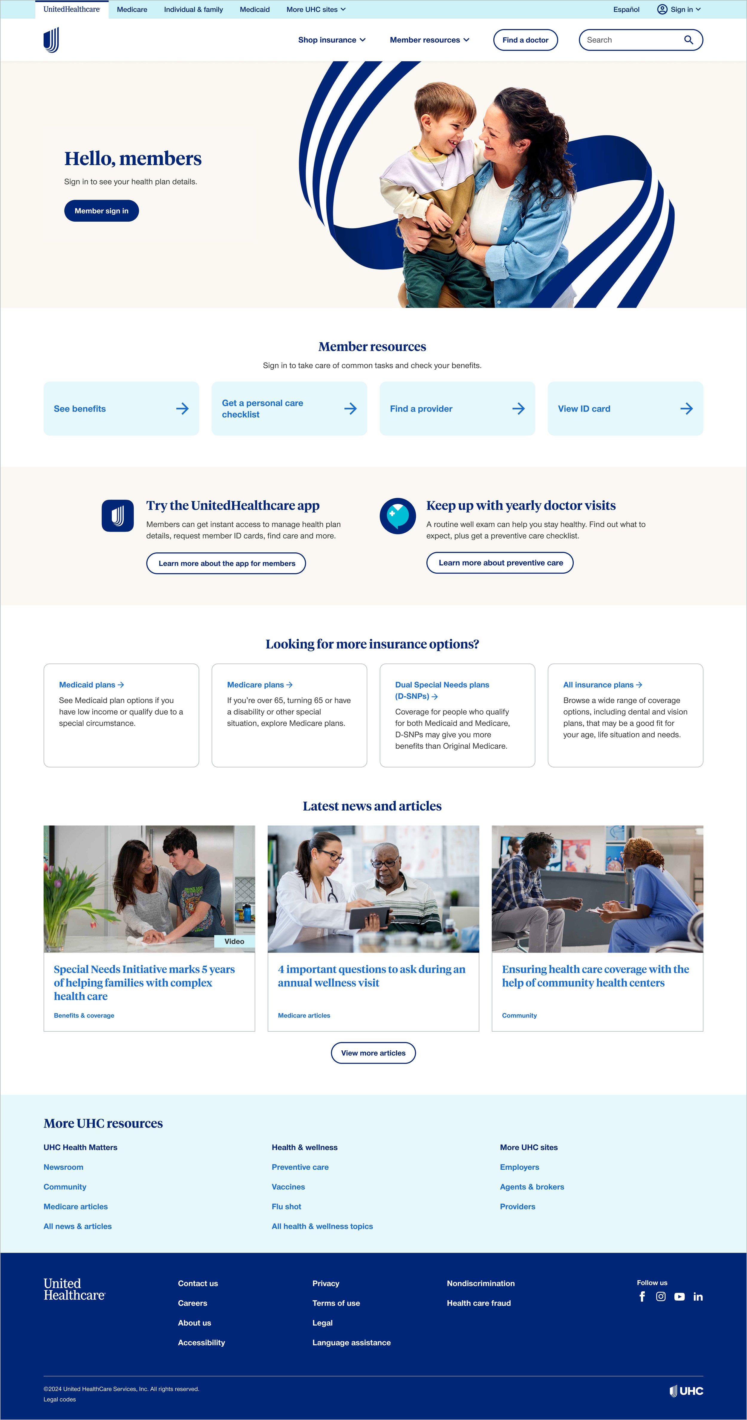
Personalized experiences
While the optimization team refreshed our personalization audiences in Adobe Target, I focused on scaling the new homepage design across personalized experiences. In the past, each personalized homepage had been treated as a bespoke project which lead to inconsistent designs and a heavy authoring burden.
This time, we set out to operationalize our homepage strategy: using the default experience as a foundation while creating a system that could cascade shared content areas across all variations. At the same time, we ensured each experience had the flexibility to meet its audience’s unique needs.
Below are the eight personalized homepage designs that came out of this work:
Employer & individual member
ACA member
Under 65 shopper
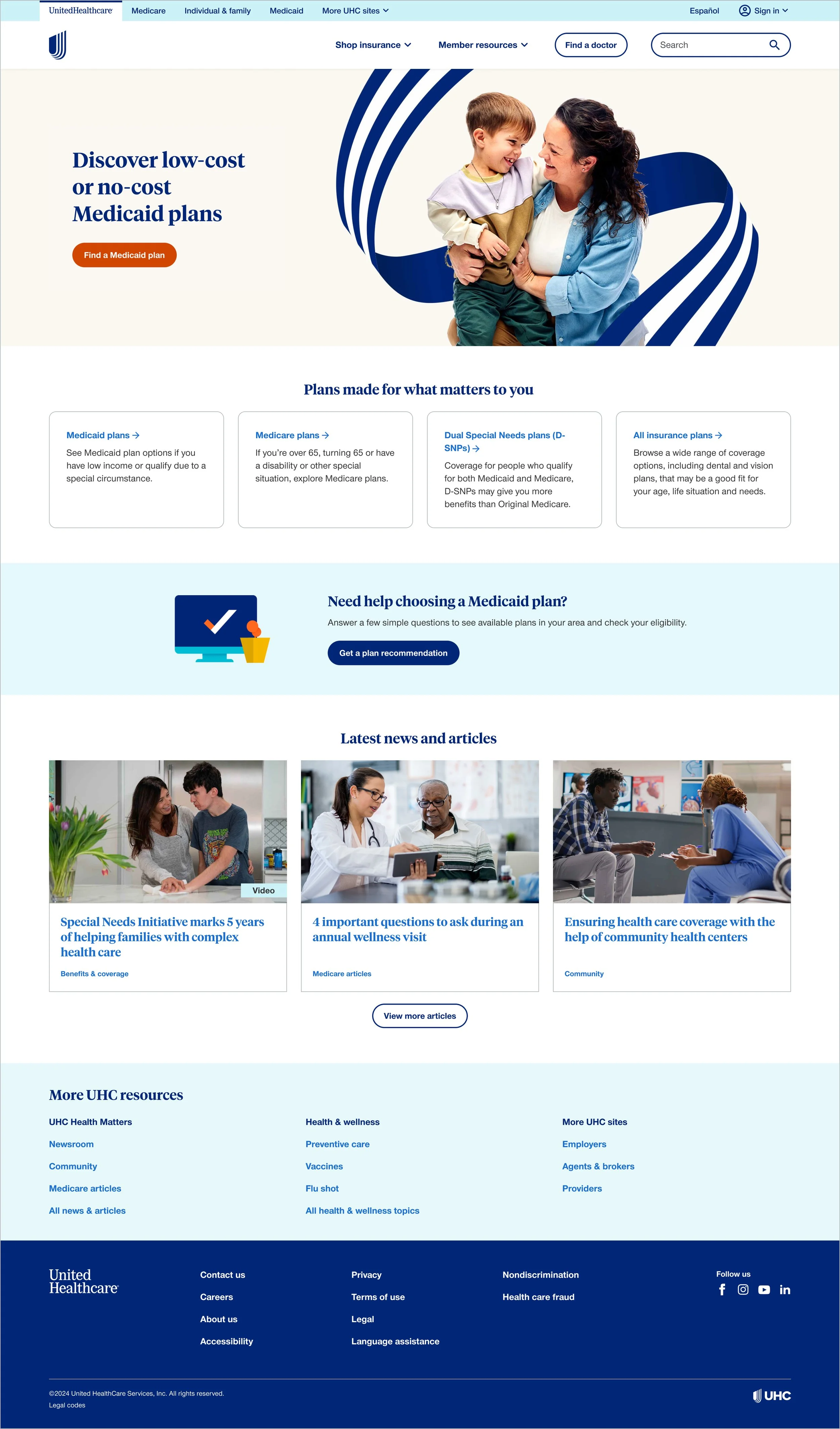
Medicaid member
Medicaid shopper
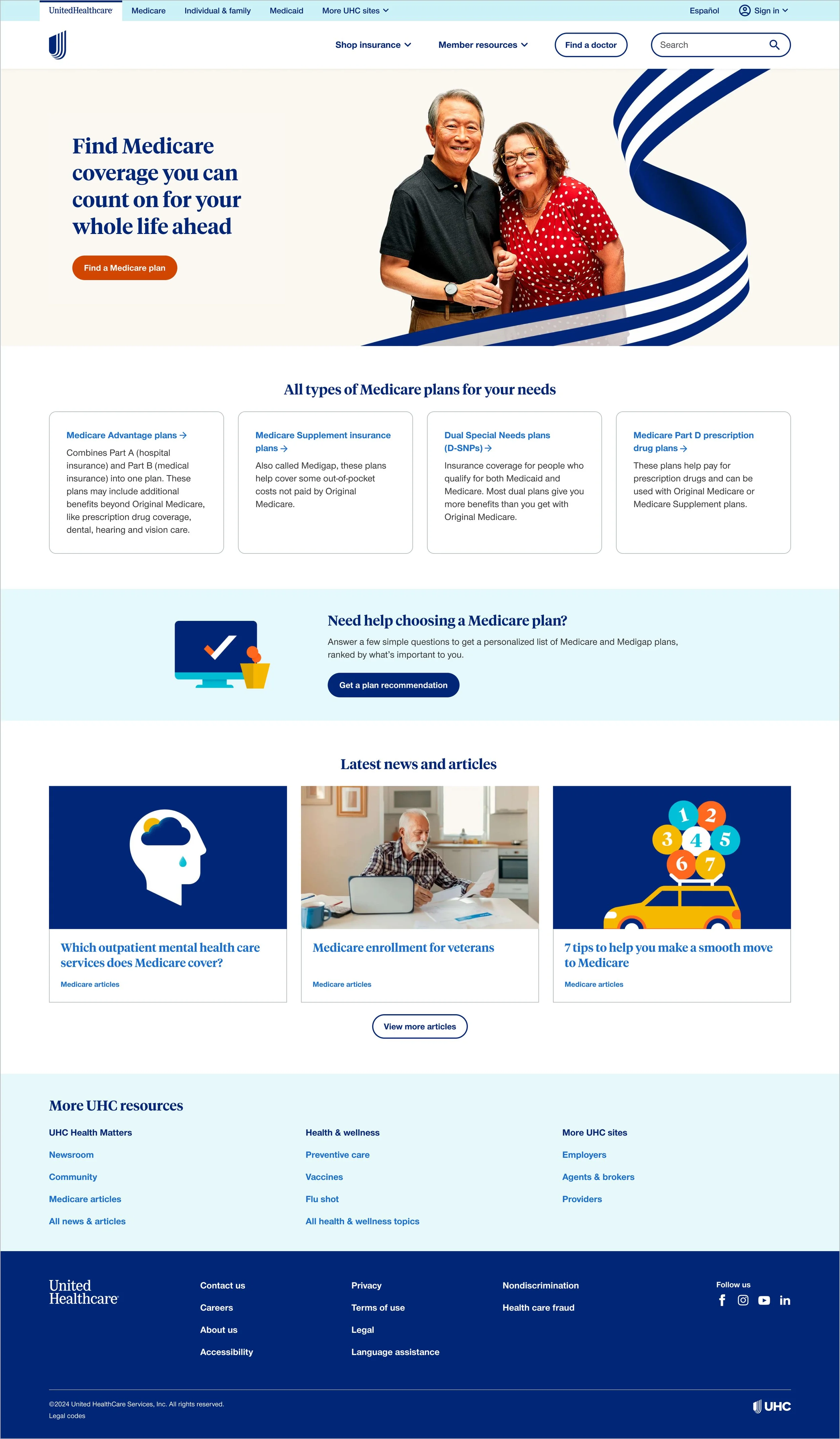
Medicare shopper
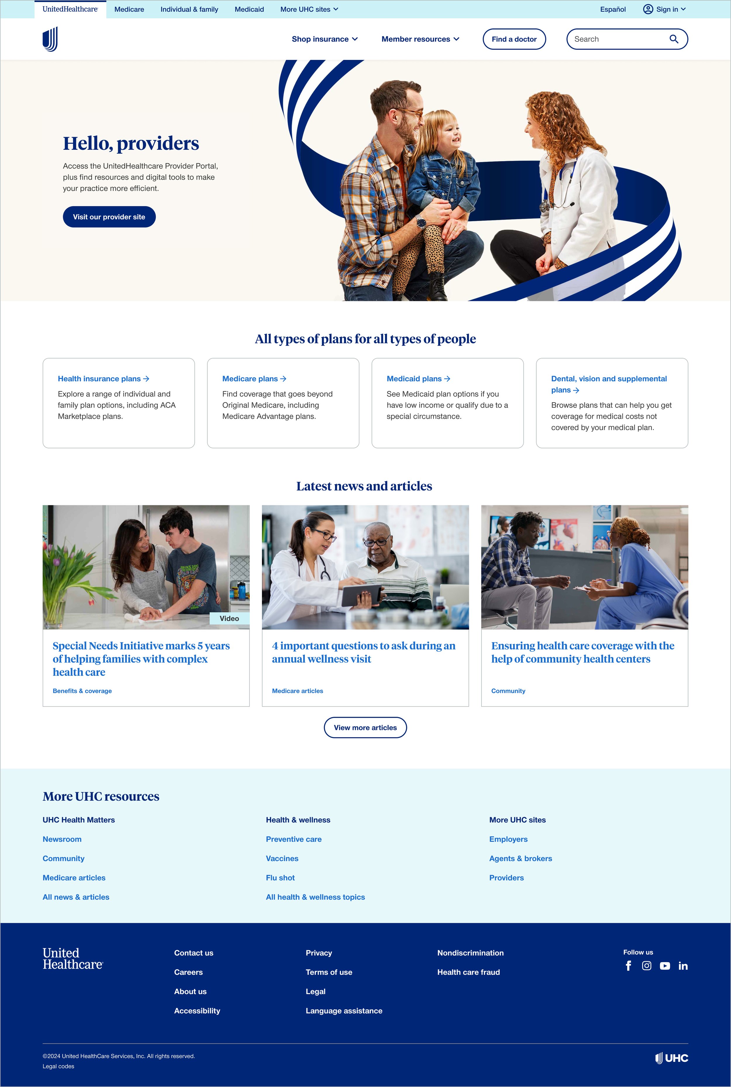
Provider
Small business
Note: our Medicare & retirement shopping audience was under evaluation, we were having issues confirming if it was working correctly.
Results
Before
After
Note: there was also a major navigation overhaul going on concurrently with this project
Average results across experiences
64%
reduced bounce rates
112%
lift in clicks on hero actions
171%
increase in leads
Post launch
Used the default experience template for various brand campaign versions of the homepage
Monthly promo updates and ongoing maintenance
Annual enrollment and open enrollment seasonal updates
Always on optimization and testing into viability of creating more specific targeted audiences
For example expanding the Medicare shopper audience to be more plan type specific such as a Medicare Advantage shopper