Design pattern library
Principal UI Designer @ UHC from 2022 - 2025
Context
The acquisition experience team relied on a pattern library that had grown inconsistent and difficult to scale across large ecosystem of public-facing experiences.
When I joined the uhc.com team, the design pattern library had recently transitioned from an external agency. While it provided a starting point, the system was incomplete, inconsistently documented, and not fully aligned with the broader enterprise design ecosystem.
As the principal designer responsible for this library, my role was to stabilize and evolve the system so it could support a complex set of public-facing experiences across uhc.com and related properties.
Because these experiences served multiple audiences, including prospective members, employers, brokers, and providers, the pattern library needed to support both visual consistency and scalable variation across many different product surfaces.
Understanding the ecosystem
Before making changes to the system, I mapped out the broader enterprise design ecosystem to understand how our library related to other systems within UnitedHealthcare.
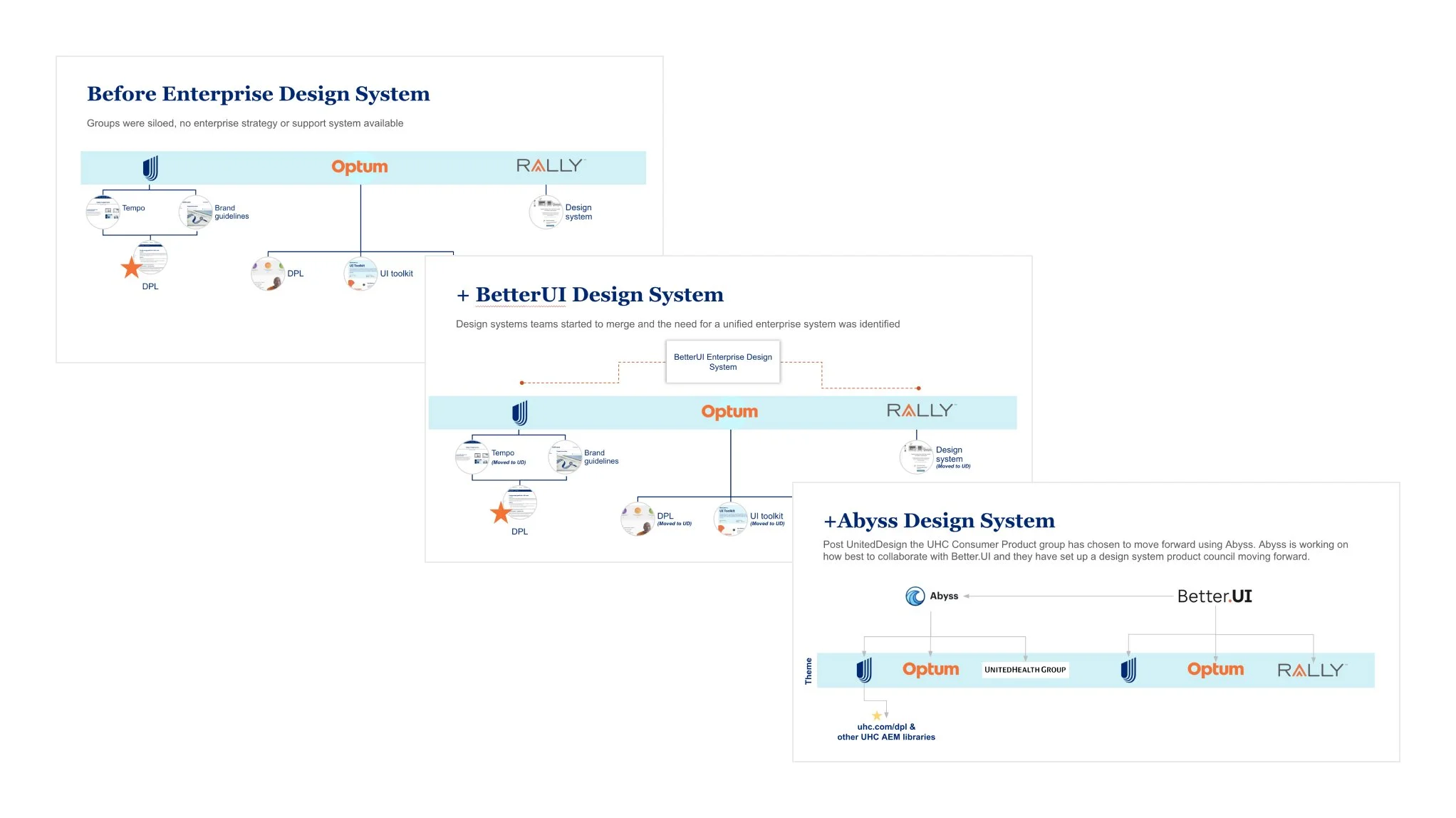
Large organizations often have multiple overlapping systems serving different parts of the business. Without clarity on those boundaries, teams can accidentally duplicate components or create conflicting patterns.
This mapping helped establish:
Where our acquisition experience system sat within the broader enterprise design landscape
Which patterns needed to align with enterprise standards
Where our team needed flexibility to support marketing-driven experiences
By clarifying the system’s role, we could make intentional decisions about what belonged in the pattern library and what did not.
Rebuilding the system foundation
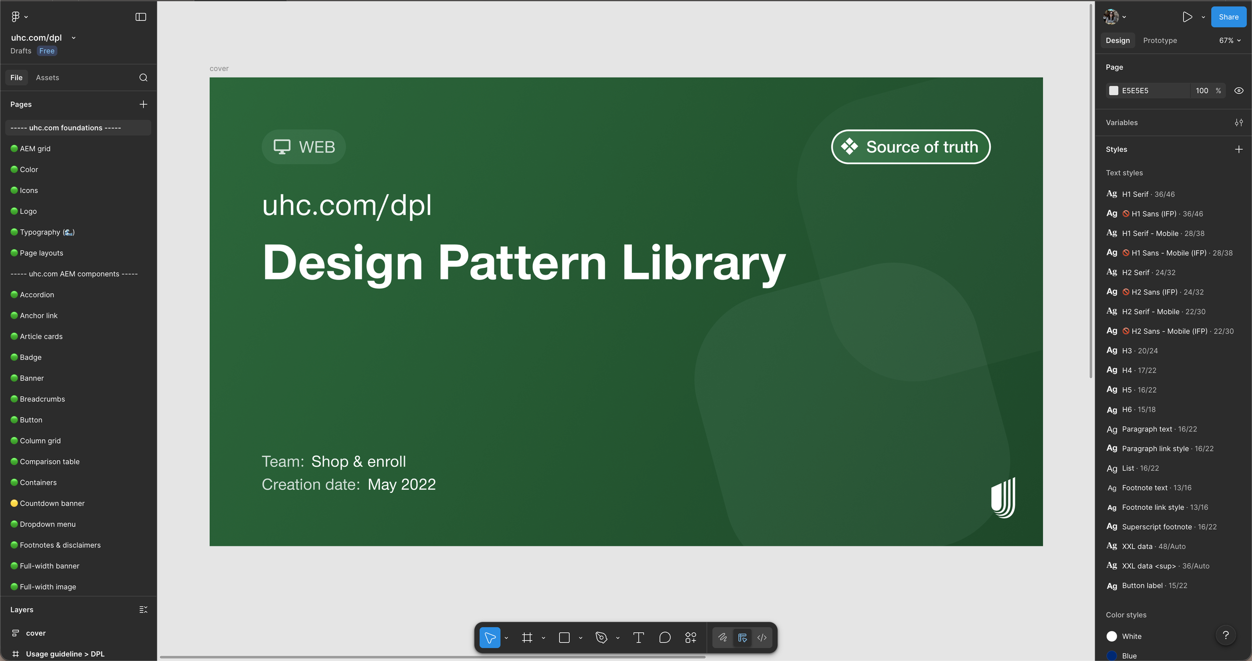
Once the system’s scope was defined, I rebuilt the library from Sketch into Figma using atomic design principles to create a scalable foundation.
The system was structured across several layers:
Foundations
Color tokens
Typography scales
Spacing rules
Responsive grid system
Components
UI elements such as buttons, cards, form inputs, and navigation patterns
multi-component structures used across common page layouts
This structure made it easier for designers, AEM authors and engineers to understand how components related to one another and how they should be applied in real experiences.
Grid system overhaul
The existing grid system had become inconsistent, relying on tight margins and custom spacing fixes that caused layouts to drift across pages and breakpoints.
I redesigned the grid across design and development, introducing consistent margins, gutters, and a standardized 12-column layout that restored alignment and re-established a scalable layout foundation.
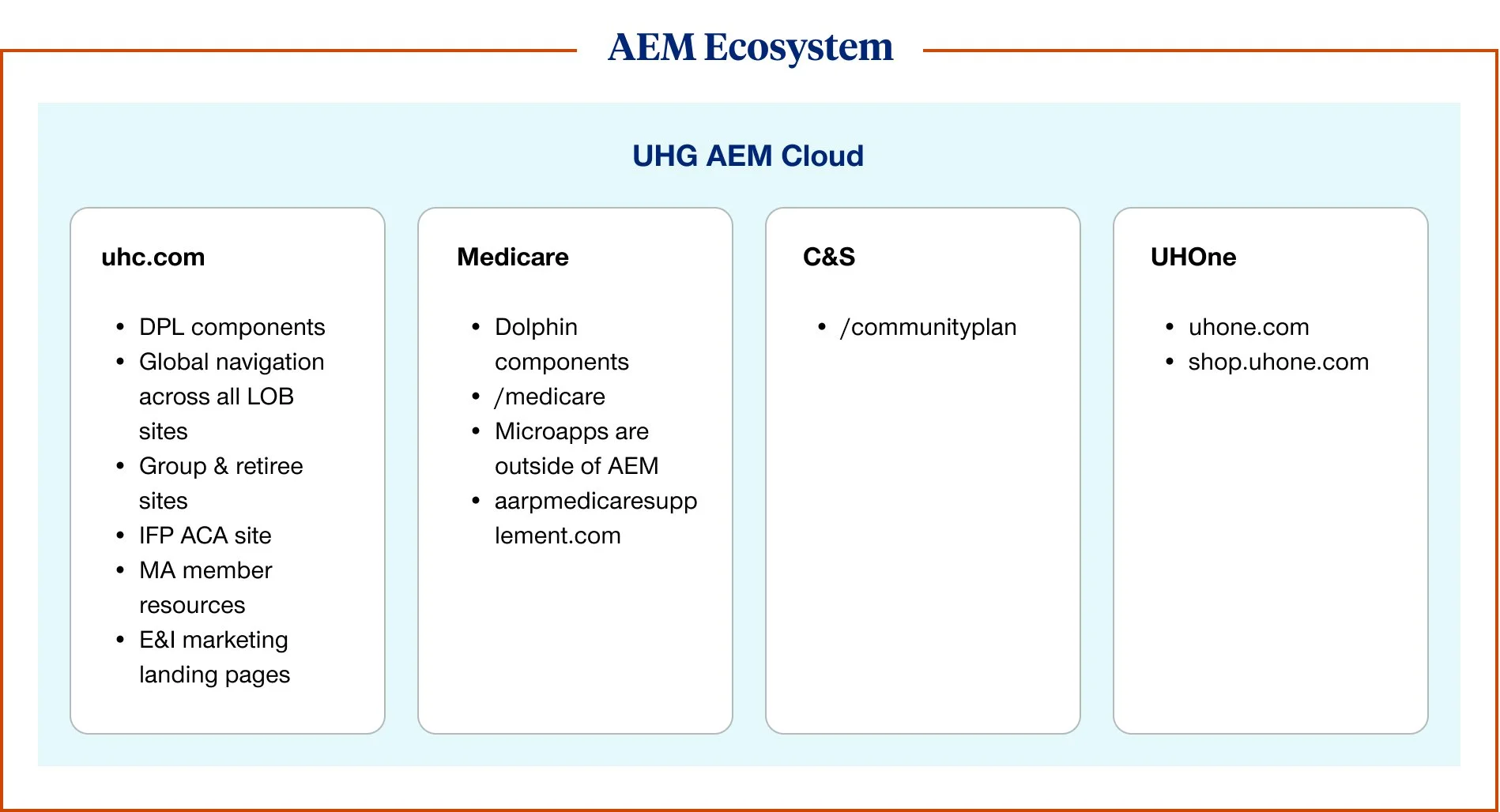
Strategy and enterprise alignment
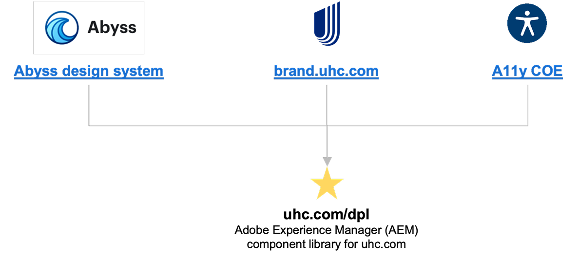
uhc.com runs on Adobe Experience Manager, which cannot directly ingest the enterprise design system used across UnitedHealth Group. The uhc.com design pattern library therefore acts as a bridge, aligning to the Abyss system as a north star while adpating patterns to the technical constraints of the AEM platform.
I defined guiding principles for when to adopt enterprise components and when to create uhc.com specific implements, and maintained an ongoing gap analysis to identify opportunities to further align the systems over time.
Documentation and adoption
To improve adoption of the design pattern library, I redesigned and expanded the documentation site to serve as a central reference for designers, developers, and content authors. The site provides component guidance, usage examples, and implementation notes to help teams apply patterns consistently across uhc.com experiences.
By pairing the Figma library with a public documentation hub, the system became easier for distributed teams and vendors to understand and implement.
Expanding the system
As the pattern library matured, new components were introduced based on real product needs across uhc.com experiences. Each addition follow the same contribution workflow, including design exploration, UX review, accessibility validation, and engineering implementation.
During my tenure the system grew to 15 net new components and 17 major enhancements, helping teams solve recurring design problems while maintaining consistency across a large ecosystem of marketing and product experiences.
Example: comparison table pattern
One example of the system evolving to support real product needs was the development of a comparison table component for ACA plan shopping experiences.
The original experience relied on static tables that were difficult to maintain and did not support flexible comparison between plans.
I designed a reusable component that allows authors to dynamically select which plans appear side by side while maintaining consistent layout and accessibility across breakpoints. To support assistive technologies, the component was implemented as a semantic data table with row header logic so screen readers can navigate plan comparisons in a meaningful way.
The final component became a scalable pattern that could be reused across plan comparison and product education experiences.
Impact
By the end of this work, the design pattern library had a foundational system supporting acquisition experiences across uhc.om.
As the primary designer responsible for the system I delivered and maintained:
15
net new components
17
major component enhancements
1,484
components in the Figma library
More importantly, the system helped teams move faster while maintaining visual consistency and accessibility across thousands of pages and multiple business units.