Re-architecting back to school
Interactive Designer @ 3M in 2016
Context
In 2016 Post-it® Brand was pivoting their digital business model to be more centered around content creation and user generated content. This was a change from their disparate ecosystem of paid media landing pages and micro sites making it challenging to support users moving organically through the content and keeping them on the site as-is.
I saw an opportunity to re-organize and enhance the architecture and design of the site to better support this change, and partnered with the technology team to put together a proposal.
Objectives
Key platforms and content are not easily accessible to the user because they live within campaign pages that aren’t part of our main navigation, making it difficult to navigate through our site
Complex and inconsistent tagging system that is limiting our ability to feature all of our articles
Relying on homepage carousel to navigate to key platforms and content
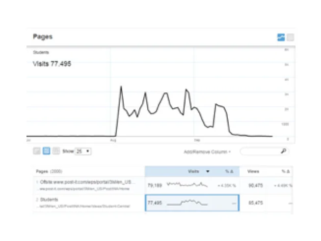
Traffic for a campaign that is only accessible through paid media advertisements

Traffic for the “Ideas” homepage that’s always accessible through the website
Proposal
Re-organize key platform pages under “Ideas” in the main navigation
(2-3 weeks for development)
Focus and simplify the tagging system
(5-6 weeks for development)
Re-design homepage
(1-2 weeks for development)
Goals
Enhanced user experience and ease of navigating the site
Reduce the complexity of the tagging system
Create a stronger presence for key platforms
Increase organic traffic and decrease site bounces
Sitemap updates
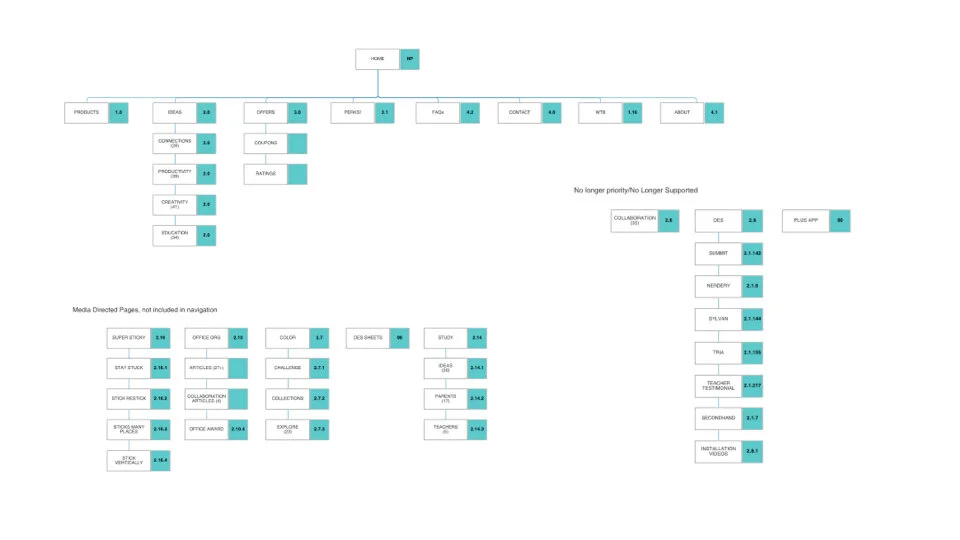
Original
In this sitemap, the key platform pages live separately from the main navigation. As well as a few pages that are floating in the ether that are no longer a priority for the business and have stopped being supported.
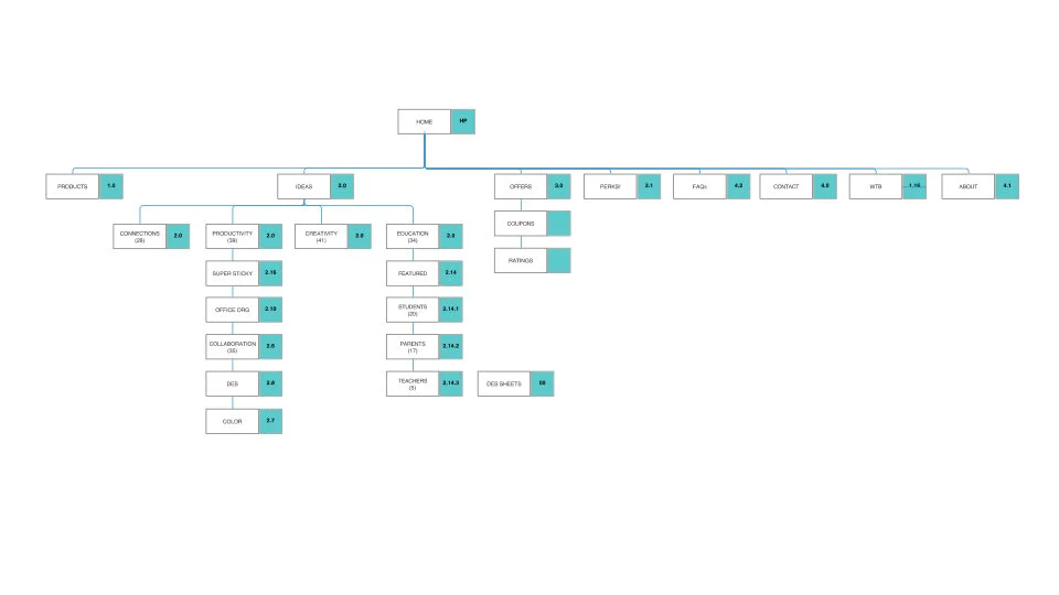
Proposed changes
In this proposed sitemap the key platform pages are moved up into the main navigation under “Ideas” under appropriate pillars, and the pages that are no longer supported have been removed.
Navigation
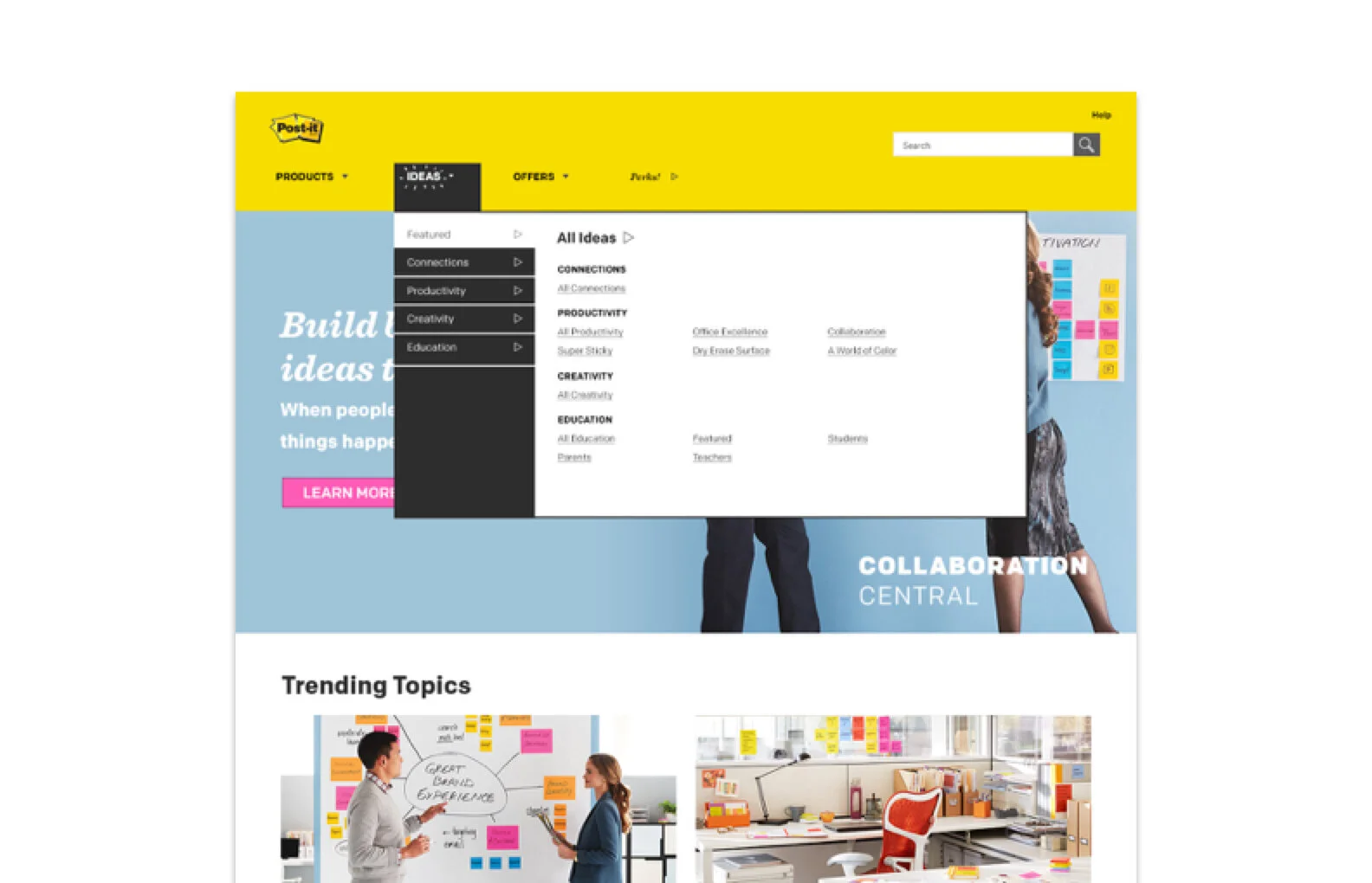
Re-organize campaign pages under “Ideas” in the main navigation
Bring key platforms into navigation and organizing under brand pillars
Cohesively organizing content
Creating better user experience to better navigate through the site
Expanded navigation will appear on all dropdowns
Long term opportunity to expand Product Catalog navigation
Tags
Limit to 4 pillars as primary tags
Reduces complexity of tags and manual work
Consistent tagging structure
Ability to create pages with a mixture of product/campaign articles
No longer use tiles to differentiate between key platforms, relying on the landing page to show unique characteristics
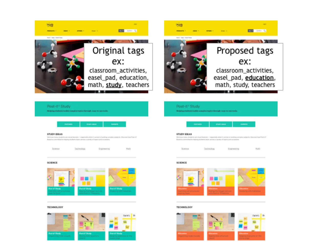
Original primary tag list
Connections (pillar)
Productivity (pillar)
Creativity (pillar)
Education (pillar)
Collaboration (platform)
Office Organization (platform)
Study (platform)
Dry Erase Surface (product)
Color (product)
Proposed primary tag list
Connections (pillar)
Productivity (pillar)
Creativity (pillar)
Education (pillar)
Primary tag: Determines color and title of tile
Homepage
Re-designed homepage
Eliminated carousel
White background to stay consistent with site aesthetic
Highlighted key programs simultaneously
Titling for clearer content labeling
Eases maintenance of homepage
Improves page load time
Argument against carousels
Often user immediately scrolls past these large images, missing essential secondary information
Less than 1% of visitors click on a carousel
Consumer Business Group (CBG) trending with industry best practices, several other iconic branded sites have foregone the usage of carousels
Accessibility issues for keyboard and screen readers, not supportive of universal design
Significant issues in mobile environment
Increases page load time